Susi's approach to the logo is a circle, a symbol of perfection, standing also for the most complete, for the Earth herself. The interruptions in the bottom part of the circle represent the imperction of conditions on our planet. The whale, here represented by it tail fin is not only an evocation of life below the surface of the oceans, but also of all creatures in need of protection.
The image has two parts. Above the horizon is what we can see and observe. Below the surface of the sea is a hidden world, we can only approach through study, but which remains hidden to most of us. The written part of the logo consisting of Mundus maris ensures a sense of unity and togetherness, of the type the Initiative represents and promotes.
 |
 |
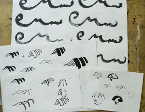
The long way from the exploratory sketches to the full-fletched portfolio presentation
 Susi prepared a complete portfolio with pick-up cards, folders, playing cards and other materials to catch the attention for activities of Mundus maris. Included were also T-shirts for kids and adults, a proposal for a flyer and a new look for the website. Even a button and stickers were proposed - in brief, an all-round graphical presentation of Mundus maris.
  The logo sits well on the visiting card to the left and stationary to the right. The relative proportions are, of course, not realistic. To complete the stationary an envelope and package label already convey a flavour of the content.
It was hard to chose between the diffeent proposals. In the end, this and the next were in second place. The members of Mundus maris congratulate Susi Eisele and the Johannes-Gutenberg Schule in Stuttgart for the great work as well as the professionalism and care taken with the entire portfolio and thank them for their effort.
We much appreciated the engagement with the objectives and work of Mundus maris and are convinced that Susi will move on to a successful professional career that will remain steeped in concern for sustainable co-habitation on the one blue planet we have.


